
Introduction to Responsive Web Design
.
16 minutes
Responsive Web Design has truly transformed the way we tackle web development. It all started with a pretty straightforward problem: “how do web designers and developers ensure that websites both look great and work seamlessly on the growing variety of devices and screen sizes?” This issue began in the early 2000s when mobile devices became common, and the diversity of screen sizes and resolutions created a major problem for web developers.
In those early days, web developers found themselves in a rather tricky situation. They had to create different versions of websites that catered for desktop and for mobile. This not only proved to be an inefficient method but was also far from sustainable, especially as the number of devices in the market continued to increase overtime.
However, the breakthrough moment arrived when web designer and developer named Ethan Marcotte introduced the concept of “responsive web design” in his article for A List Apart in May 2010. He proposed an elegant solution – designing websites that adapt fluidly to the width of the device’s viewport.
So, the introduction of Responsive web design was a game-changer because it allowed a single website to gracefully adjust to different screen sizes. This concept gained popularity as web designers and developers saw its great potential. Today, it’s considered the best approach in web design.
What Is Responsive Web Design All About?
In today’s digital era, where almost everyone uses a smartphone, being responsive in web design isn’t just a passing fad; it’s a must. Let’s get into the facts: mobile internet usage surpassed desktop usage in 2016. Since then, mobile usage has grown even stronger. The omnipresence of smartphones means that your website must be adaptable to various screen sizes, from large desktop monitors to the smallest of mobile screens.
Back before Responsive Web Design became standard, web design was a different ballgame. Websites were primarily tailored for desktop screens, which had fairly standardized sizes and resolutions with 800px and 1024px. When mobile devices started gaining popularity, web developers usually had to deal with a myriad of problems which spanned from pinching the screens to zooming and scrolling. More so, clicking buttons was burdensome to deal with. Hence, why developers had to access a separate mobile-optimized version of websites. The problem was clear when websites had separate mobile versions. It was a hassle because it meant maintaining two different site versions, which was time-consuming and expensive. What’s worse, the mobile sites often lacked features and content compared to the desktop version. Users wanted a consistent experience on any device they used. #Why does this matter? Well, it all boils down to user experience, which is crucial in our modern age. When a website isn’t mobile-friendly, users get frustrated and leave. With many alternatives available, they’re unlikely to return to a site with a poor user experience. Also, SEO is vital. Google has embraced a mobile-first indexing approach, so having a responsive site can significantly impact your search engine rankings. But there’s more. Responsive design is efficient, saving time and resources. Instead of juggling multiple site versions, you can have just one. This streamlines development and is cost-effective. In the big picture, responsive web design isn’t a nice extra; it’s a must for any site or app in today’s digital age. Now, let’s explore why responsive web design is so crucial in more detail.
Why is Responsive Web Design Important?
Improved User Experience: When your website responds smoothly to various screen sizes, it offers users a seamless and enjoyable experience. This can lead to increased engagement and longer visit durations on your site. Broader Audience Reach: With the increasing diversity of devices used for browsing the web, a responsive design ensures that your content is accessible to a wider audience.
Google’s Ranking: Search engines, particularly Google, appreciate and often reward responsive websites with higher search rankings. This means better visibility in search results. Cost-Effective: Maintaining a single responsive website is more cost-effective than creating and managing separate versions for different devices. Adaptation to Future Devices: As new devices with various screen sizes emerge, a responsive design future-proofs your website. You won’t need constant overhauls of your websites to keep up with the latest devices being released. Faster Loading Times: Responsive websites tend to load faster on mobile devices, which is important for retaining visitors. Slow-loading sites can drive users away from your site. Statistics show that if your site loads for more than 5 seconds, you are likely to have a 123% bounce rate by visitors. And higher bounce rates signifies to Google that your site is not interesting to users, which also hurts your ranking.
Defining Responsive Web Design.
Responsive Web Design is essentially a design and development strategy that focuses on crafting web pages capable of responding to various aspects like the user’s screen size, the platform they’re using, and even the orientation of their device. It’s all about ensuring that when someone visits a website, regardless of whether they’re on a desktop computer or a smartphone, the experience is smooth and enjoyable. The whole concept behind Responsive Web Design is to make web content adapt gracefully, eliminating the need for creating entirely separate designs or even separate websites for different devices. It achieves this by using a blend of flexible grids, adaptable layouts, smart image handling, and CSS media queries to ensure that the website looks and functions just right, regardless of the device or screen it’s being viewed on.
The Pillars of Responsive Web Design
Responsive web design is built upon these fundamental pillars: a. Flexible Grids: Grid systems are the foundation of Responsive Web Design. They involve creating a layout that is based on a grid structure, which can adapt to different screen sizes. So, using relative units such as percentages instead of fixed units like pixels, designers ensure that content resizes appropriately. b. Media Queries: Media queries are a vital tool in Responsive Web Design. They allow developers to apply different CSS styles based on various conditions, such as screen width, height, or orientation. This enables content to adjust dynamically to different devices. c. Flexible Images: Images are an essential part of web design, but they can pose challenges in Responsive Web Design. Flexible images, achieved through techniques like setting max-width to 100%, ensure that images scale appropriately without breaking the layout on smaller screens. Flexible Layouts with Grids At the core of responsive web design lies the concept of grids. Traditionally, web layouts were designed with fixed dimensions, often in pixels. However, this approach becomes problematic because it fails to accommodate the diverse screen sizes and orientations of modern devices. Grids, on the other hand, provide a flexible and adaptable layout structure. Instead of using fixed measurements like pixels, designers and developers use relative units, such as percentages, for defining column widths and layout elements. This enables the grid to expand or contract fluidly in response to the available screen space. For instance, a web page designed with a grid might specify that a column should occupy 25% of the available width. On a large desktop screen, this would translate to a substantial column. But when viewed on a smaller smartphone screen, that same column would automatically adjust to fit within the narrower width without breaking the layout.
Creating a Responsive Grid System
When it comes to crafting a responsive grid system, you have to figure out how many columns you want and the overall structure of your layout. Most grid systems you’ll encounter use a 12-column layout as a starting point, but this number can vary based on how intricate your design needs to be. The crucial part is making sure that when you add up the widths of your columns, including any space between them (like gutters or margins), it all adds up to 100% of the available width. This is what keeps your layout flexible and responsive. For instance, in a 12-column grid, each column might occupy a specific percentage of the total width, with the right amount of spacing around them. This clever setup allows the columns to automatically adapt their size as the screen size changes, maintaining a visually pleasing and balanced layout.
Implementing Grid System in CSS
Now, to actually implement this grid system in CSS, you’ll mainly be working with percentages for the column widths and margins to achieve that responsiveness. Or fraction method. Here’s a simple example of a 12-column grid system:
/ Define a container to hold the grid /
.grid-container {
  width: 100%;
display: flex;
  flex-wrap: wrap;
justify-content: space-between;
box-sizing: border-box; }

/ Define the grid items (columns) /
.grid-item {
  width: calc(33.33% - 10px);
margin: 5px;
  box-sizing: border-box;
}
/ On smaller screens, adjust the column width /
@media screen and (max-width: 768px) {
  .grid-item {
    width: calc(50% - 10px);
 }
}
In the code above:
- We create a container element with the class
grid-containerto hold our grid system. It’s set to 100% width and uses flexbox for alignment. - Each grid item (column) has the class
grid-item. We define the width of each column using thecalcfunction to ensure that they take up 33.33% of the total width with 10px gutters. Thebox-sizingproperty is set toborder-boxto include padding and borders in the column width calculation. - To make the grid responsive, we use a media query to adjust the column width when the screen width is 768px or smaller. In this case, columns span 50% of the total width with 10px gutters.
You can customize the code by changing the number of columns, gutter width, and screen width breakpoints to suit your specific design requirements.
On the other hand, we can create a responsive grid system using CSS Grid with the
grid-template-columnsproperty and fractions in css:
.container {
  display: grid;
  grid-template-columns: repeat(auto-fit, minmax(200px, 1fr));
  grid-gap: 20px;
}

.item {
  background-color: #e0e0e0;
  padding: 10px;
  text-align: center;
}
In the above example:
-
We define a container with the class
.containerand set itsdisplayproperty togrid. -
The
grid-template-columnsproperty is used to define the columns. We userepeat(auto-fit, minmax(200px, 1fr)), which creates as many columns as can fit in the available space, each with a minimum width of 200px and a flexible width (1fr) to distribute any remaining space equally. -
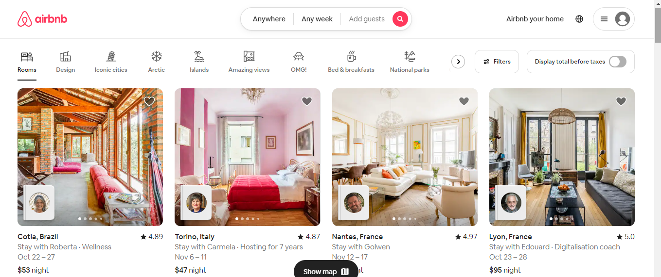
grid-gapis set to provide some spacing between grid items. Now, you can place your HTML content within this grid structure, and it will automatically adapt to the available space, ensuring a responsive layout. For visual instances, this is the airbnb website which stipulates the grid system. On the desktop screen, this is what it looks like: many columns as can fit in the available space, each with a minimum width of 200px and a flexible width (1fr) to distribute any remaining space equally. -
grid-gapis set to provide some spacing between grid items.
Now, you can place your HTML content within this grid structure, and it will automatically adapt to the available space, ensuring a responsive layout.For visual instances, this is the airbnb website which stipulates the grid system. On the desktop screen, this is what it looks like:
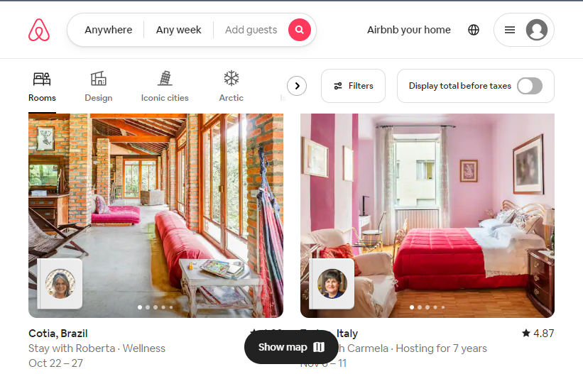
On medium screen, the grid takes up 6 columns each:
On medium screen, the grid takes up 6 columns each:
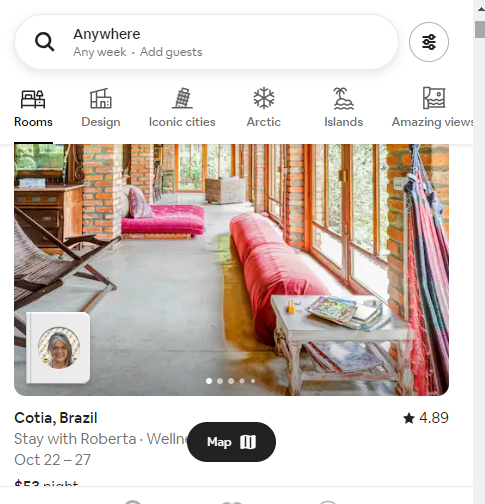
While on the mobile screen, however, it takes up the whole 12 columns of the screen.
The Concept of Media Queries
While grids provide the foundation for flexible layouts, media queries are the means by which you apply different styles and adapt the layout based on specific conditions. Media queries are a part of CSS and are used to define rules based on specific conditions.
For instance, you can use a media query to state that if the screen width is below 600 pixels (which is common for small smartphone screens), the layout should adapt. This can include changing column widths, adjusting font sizes, or even hiding some elements to create a better display for smaller screens.
Media queries are incredibly versatile and can target various properties such as screen width, height, orientation (portrait or landscape), and even the device’s resolution. They provide the precise control needed to create responsive designs that cater to various devices.
Implementing Media Queries in CSS
To implement media queries in CSS, you typically use the @media syntax. This allows you to specify a set of CSS rules that apply when certain conditions are met. Here’s a simplified example of a media query in CSS:
@media screen and (max-width: 600px) {
  / CSS rules for screens with a maximum width of 600px /
  body {
    font-size: 16px;
  }
  .container {
    width: 100%;
  }
}
In the example provided, when the screen width is 600 pixels or less, the font size of the body text increases to enhance readability on smaller screens. The container width is also set to 100% to ensure it occupies the entire screen width.
Responsive Typography
In responsive web design, making text readable across various devices and screen sizes is of paramount importance. Text that’s too small or too large can hinder the user experience. To ensure readable text, you need to define font sizes that are appropriate for different screen sizes. That means using relative units such as em or rem instead of fixed units like px which allow text and elements to scale effectively across different screen sizes. To better understand the differences between the units:
- Pixels (px): A pixel is the smallest unit of measurement on a screen. In web design, a pixel (
px) is an absolute unit of measurement, which represents a fixed size on the screen, regardless of the device’s characteristics or user preferences. This can lead to text and elements appearing too small or too large on different devices, especially when viewed on various screens or with different resolutions. For instance:
 p {
 font-size: 16px; /* Font size set in pixels */
}
In the above example, the font size for all <p> elements is fixed at 16 pixels. This would not adapt to different screen sizes or user preferences.
2. Root Em (rem): The “rem” unit, which stands for “root em,” is a relative unit of measurement in CSS. The “rem” unit is a relative measurement in CSS that’s based on the font size of the root element (usually the <html> element) of a web page. This means that all elements defined in “rem” units will be relative to this root font size. Using “rem” ensures consistent and scalable typography across different devices and screen sizes. “Rem” units are commonly used in responsive design for defining font sizes, margins, and padding because they adapt well to different screen sizes and user preferences.
html {
font-size: 16px; /* Set the base font size for the root element */
}
p {
font-size: 1.5rem; /* Font size relative to the root element's font size */
  }
In the above example, the root font size is set to 16 pixels, and the <p> element’s font size is set to 1.5 times the root font size, making it 24 pixels. This allows for scalability.
3. Em (em): The “em” unit is also a relative unit of measurement, but it is relative to the font size of the parent element. When you define an element’s size in em units, it is based on the font size of its nearest parent element. This makes it flexible for scaling text and elements in relation to their parent, which can be useful in certain design scenarios. For instance:
   p {
       font-size: 1.2em; /* Font size relative to the parent element's font size */
   }

   div {
       font-size: 1.4em; /* Font size relative to the parent element's font size */
   }
Sizing Text Responsively When working with responsive typography, there is also a need to consider both minimum and maximum font sizes. On small screens, text should be legible without the need for zooming, while on large screens, it should maintain a comfortable reading experience without becoming excessively large. Media queries are important for responsive typography. They allow you to set different font sizes based on the screen’s width. For example, you might define larger font sizes for desktop screens and smaller font sizes for mobile devices. Line Length and Line Height In addition to font size, line length (the number of characters per line) and line height (the space between lines of text) are critical considerations for readability. Long lines of text can be challenging to read, especially on narrow mobile screens, while insufficient line height can make text feel cramped. For Accessibility concerns, it is important to maintain a minimum of 1.5 line-height for paragraph content Responsive web design addresses this by adjusting line length and line height based on the screen size. Media queries can be used to change these values to ensure text remains legible and visually appealing on different devices. Flexible Images and Media Images are a fundamental component of web design, but they present a unique challenge in responsive web design. Images often have fixed dimensions, and resizing them improperly can lead to distorted or awkwardly cropped visuals. For instance, an image that looks perfect on a large desktop screen may be too wide for a smartphone display. To tackle this issue, responsive web design employs techniques that allow images to scale and adapt to the available screen space. CSS Techniques for flexible images and media CSS techniques provide solutions to make images more responsive. One common approach is to set the maximum width of images to 100%. This ensures that images won’t exceed the width of their containing element, preventing overflow or distortion.
img {
  max-width: 100%;
  height: auto;
}
The max-width: 100% rule allows images to scale down proportionally when the available screen width is smaller, maintaining their aspect ratio. The height: auto rule ensures that the image’s height adjusts accordingly.
The Role of HTML’s ‘srcset’
HTML5 introduced the srcset attribute, which offers an elegant solution for responsive images. With srcset, you can provide multiple image sources at different resolutions or sizes. The browser then selects the most appropriate source based on the user’s device and screen characteristics.
For example:
<img src="small.jpg" srcset="small.jpg 480w, medium.jpg 800w, large.jpg 1200w" alt="Responsive Image">
In the above example, the browser selects the image source that best fits the available screen width and resolution.
Background Images and Responsive Design
Background images, often used for headers or hero sections, pose unique challenges in responsive web design. To ensure these images adapt correctly, web designers use CSS properties like background-size and background-position.
Setting the background-size: cover, enables you to make a background image cover the entire container while maintaining its aspect ratio. You can also adjust background-position to ensure that the most important part of the image remains visible.
Navigation in Responsive Design
Navigation menus serve as roadmaps for users to explore your website. In responsive design, creating navigation that works seamlessly on both large desktop screens and small mobile devices is also an important aspect.
One common approach is to transform traditional horizontal navigation menus into collapsible menus on smaller screens. These menus are often represented by an iconic “hamburger” icon on smaller screens. When clicked, the menu expands to reveal navigation links. This approach conserves screen space on mobile devices without being cramped and allows for a smooth, user-friendly experience.
This is the desktop screen on Shopify website:

And the image below shows the navigation enclosed by the hamburger


Navigation Patterns for Mobile Devices On mobile devices, traditional navigation menus often need to be considered depending on the application. Aside from the hamburger menu, alternative navigation patterns include the tab bar, and the bottom navigation bar. Each pattern has its advantages and should align with the overall user experience and content structure.
Optimizing Performance
Speed Matters
In our current digital age, where users demand instant access to information and seamless experiences, the speed of your website is of paramount importance. Slow-loading pages can lead to user frustration and high bounce rates, negatively impacting your site’s success. Optimizing performance in responsive web design isn’t just about making your site faster; it’s also about ensuring a consistent experience across devices. Here are key aspects to consider:
Image Optimization
Images are often the heaviest elements on a web page. Optimizing images for performance is crucial. You can achieve this by:
- Compressing images to reduce file size while maintaining visual quality.
- Using modern image formats like WebP and svgs, which offer better compression and quality.
- Employing lazy loading to defer the loading of off-screen images, conserving bandwidth and speeding up page loading.
Minification and Compression
Minification involves removing unnecessary characters and white spaces from CSS, JavaScript, and HTML files. This reduces file sizes and enhances load times. Compression, on the other hand, involves enabling server-side compression (GZIP) to send compressed files to the browser, which are then decompressed for rendering. Both techniques significantly improve page load speed.
Browser Caching and Its Impact
Browser caching allows previously downloaded resources to be stored on the user’s device. This means that when a user revisits your site, certain elements (like images, CSS, and JavaScript files) don’t need to be downloaded again, reducing load times. Configuring proper caching policies helps you to leverage this performance boost on your website. Reducing HTTP Requests Every HTTP request made by a browser adds to the load time of a web page. Reducing the number of requests can lead to faster load times. Strategies for reducing requests include:
- Combining multiple CSS or JavaScript files into a single file to reduce the number of file requests.
- Using image sprites to group multiple images into a single image file, reducing image requests.
- Employing asynchronous loading of non-essential resources to load them without blocking the rendering of the page.
The Importance of Cross-Browser Compatibility
Different browsers may interpret CSS and HTML code differently, potentially leading to design discrepancies. That is why Browser compatibility testing tools can help identify and fix issues that may arise.
Tools for Testing Responsive Design
Numerous tools and platforms can assist in testing responsive design. Some popular choices include:
- Browser developer tools: Most web browsers offer built-in developer tools that allow you to simulate different device sizes and test responsive layouts.
- BrowserStack: A cross-browser testing tool that enables you to view your site on various browsers and devices.
The Mobile-First Approach
The mobile-first approach is a fundamental concept in responsive web design. Instead of designing for larger screens and then scaling down, it starts with designing for mobile devices and progressively enhancing the design for larger screens. This approach ensures that the most critical content and features are optimized for mobile users. Rethinking the design process in this way often leads to cleaner and more user-focused design decisions.
Benefits of Mobile-First Design
Mobile-first design offers several benefits: Improved user experience on mobile devices, where users expect quick access to essential content. Faster load times, as mobile-first designs typically include fewer resources and are optimized for performance. Enhanced content prioritization, as designers must identify the most critical content for mobile users. A focus on touch interactions, ensuring that buttons and elements are designed for mobile touch screens. In the mobile-first approach, the design is progressively enhanced for larger screens. This means that as screen size increases, additional features, content, and design elements are added to create a more robust desktop experience. Media queries play a crucial role in progressive enhancement. They enable designers to specify how the design should change as the screen size grows. For example, on larger screens, additional columns or sidebars might be introduced, and font sizes might be increased for readability.
Accessibility in Responsive Design
Web accessibility ensures that people with disabilities can access and interact with your website. It’s not only a legal requirement in many countries but also a fundamental aspect of user-centered design. In responsive design, ensuring accessibility across devices is vital.
Responsive Design and Accessibility
Responsive design can enhance web accessibility in several ways: Text Adaptation: Responsive design often involves changes in font size, ensuring that text remains legible for all users, including those with visual impairments. Users can zoom in on text when necessary without causing layout issues. Touch Targets: Responsive design considers touch interactions on mobile devices. Buttons and interactive elements are designed to be touch-friendly, benefiting users with motor disabilities. Screen Reader Compatibility: Properly structured HTML and semantic elements in responsive design improve compatibility with screen readers. This ensures that users with visual impairments can navigate your site effectively. Alternative Text for Images: Responsive design encourages the use of alt text for images, helping users with visual impairments understand the content and context of images. Color Contrast: Color contrast is crucial for users with low vision or color blindness. Responsive design often involves adjusting color schemes to maintain adequate contrast for readability. Responsive design offers an opportunity to create websites that are accessible to all users, regardless of their abilities or the devices they use. For a detailed walkthrough on accessibility in web applications, check out this article on Building A better website.
Future-Proofing Your Website
The digital world is always changing. New gadgets, screen sizes, and tech pop up all the time. Responsive design goes along with the newest design and development trends. So, staying up to date makes sure your website looks modern and visually appealing without compromising on user experience. Trends such as microinteractions, smooth scrolling, and dark mode can be seamlessly integrated into your responsive design. Future-proofing your website through responsive design is an investment in its long-term success. It ensures that your site can change with the ever-shifting digital world and keep giving people a top-notch user experience.
Conclusion
So, there you have it – responsive web design is not a trend; it’s a fundamental approach and a must-have in creating websites that adapt to the diversity of devices. Responsive web design is the cornerstone of a user-friendly, adaptable, and successful online presence. In an era where digital interaction occurs across a wide range of devices, investing in a responsive design is not just a choice; it’s a necessity for anyone looking to make an impact on the web. It’s the key to keeping your users happy on any device, boosting SEO, and keeping your cash safe and sound.
Leave a Reply